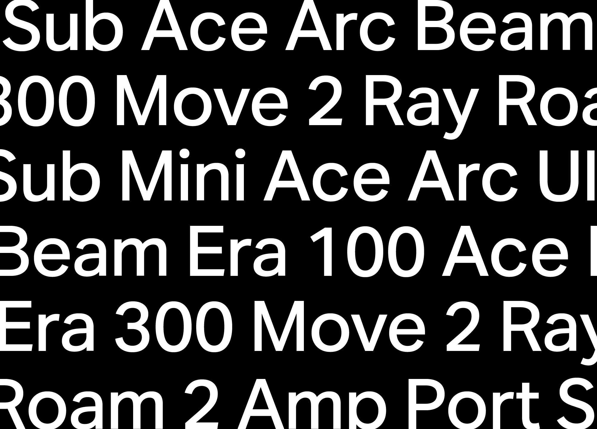
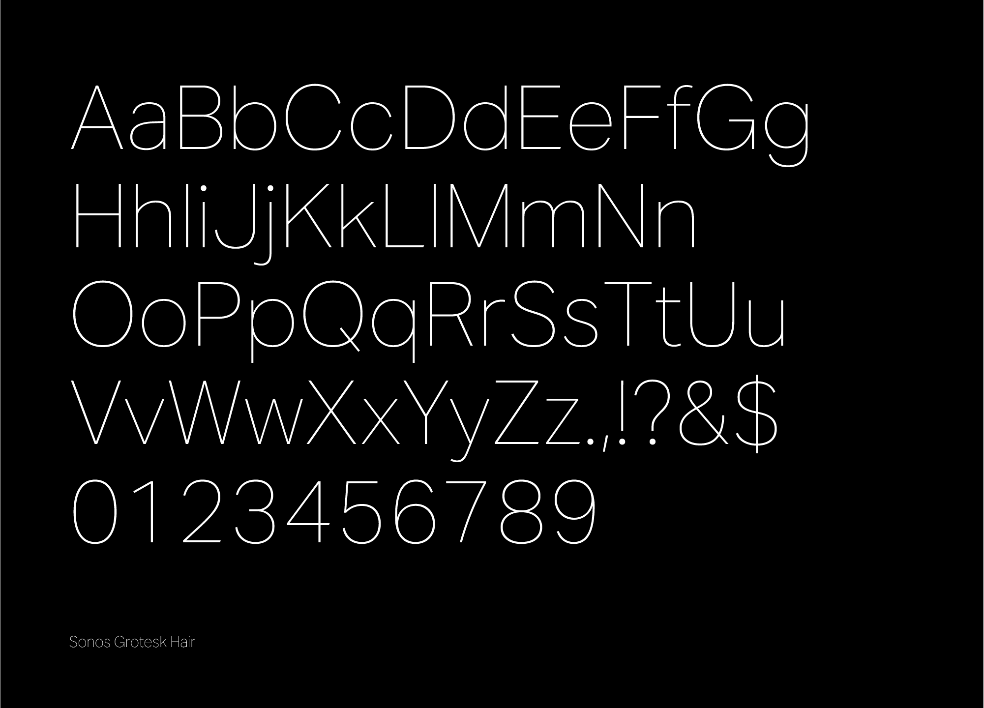
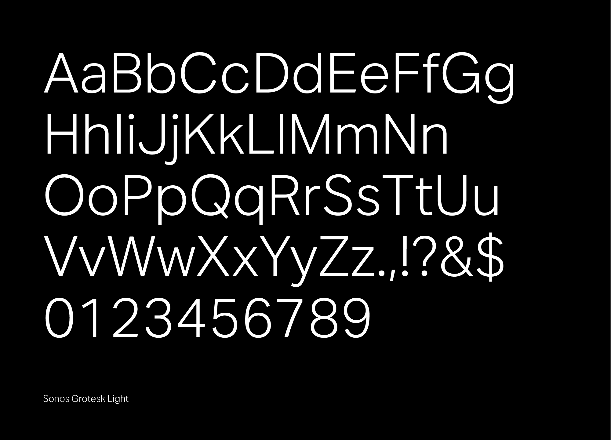
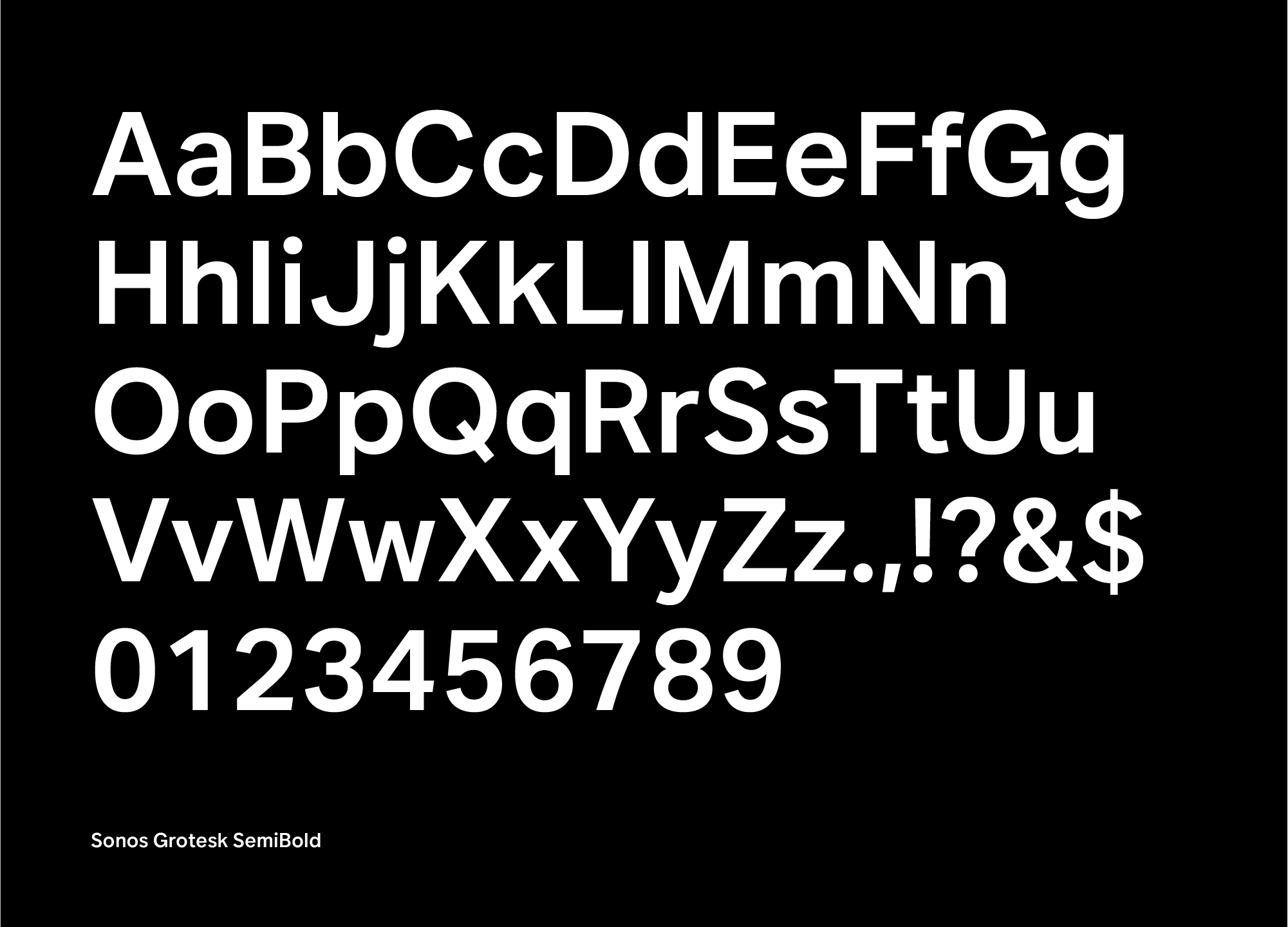
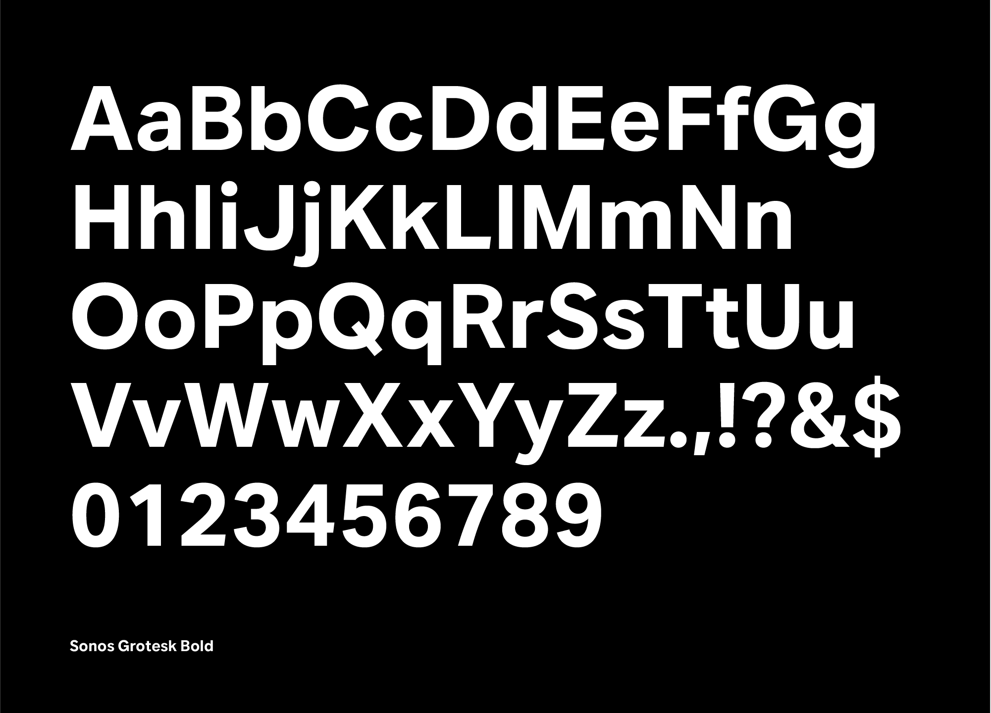
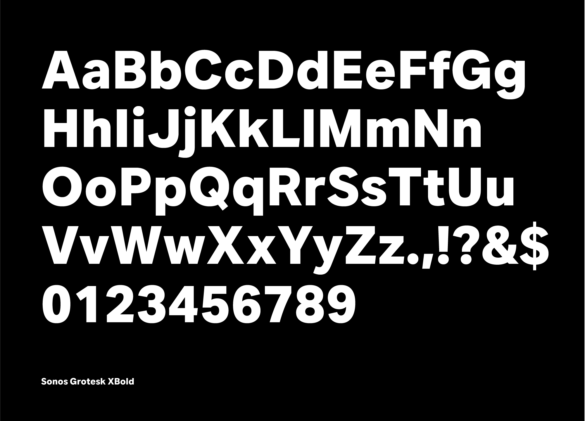
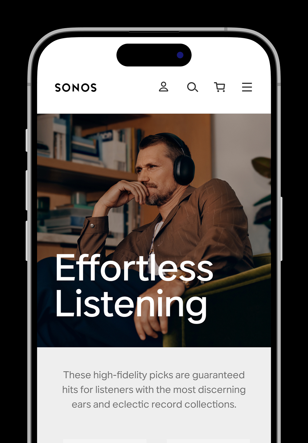
Sonos Grotesk
︎Type Design
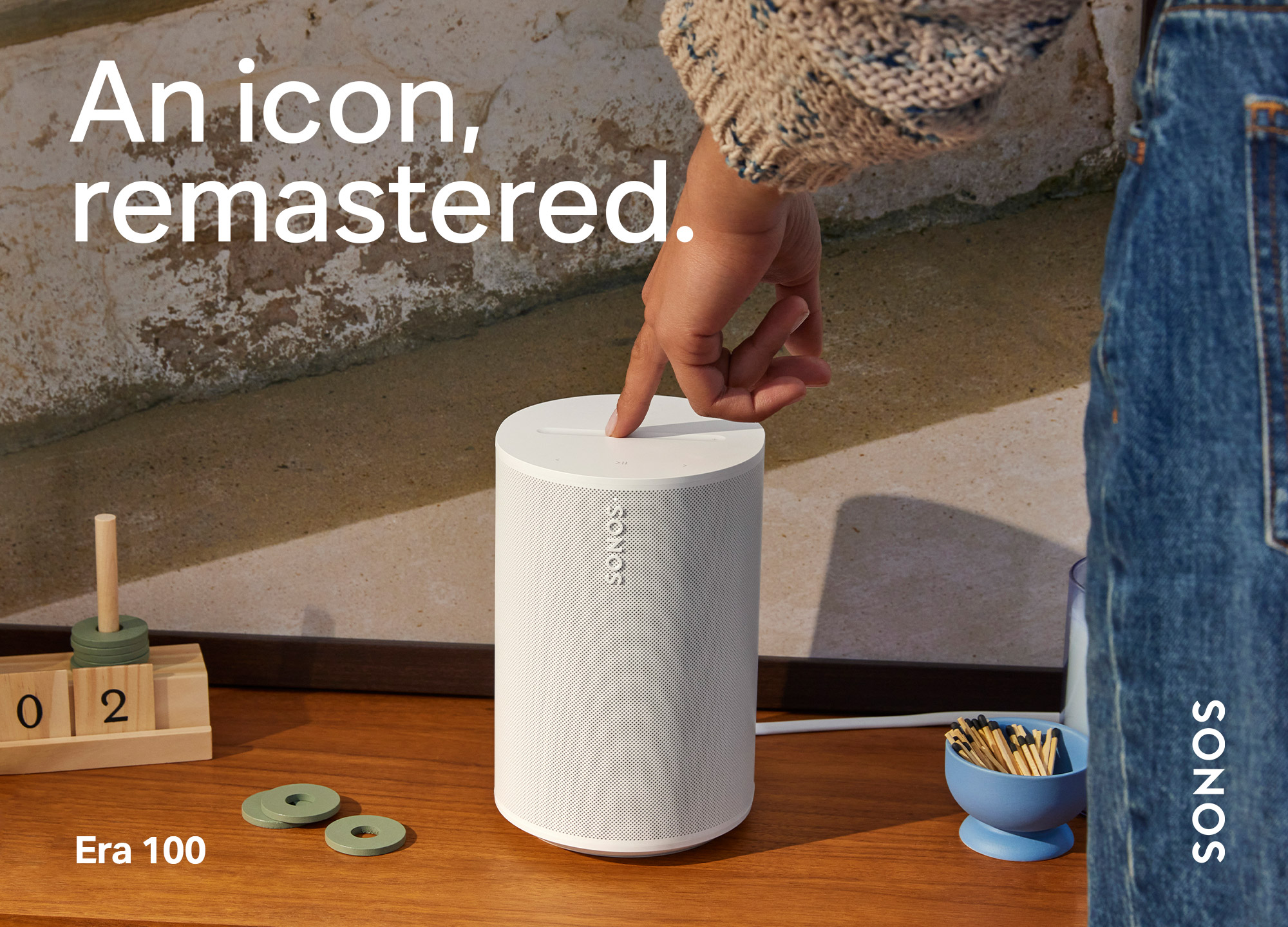
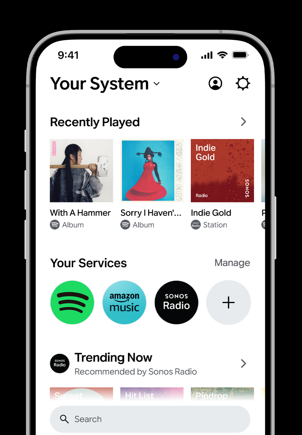
Sonos has relied on Aktiv Grotesk as its typeface, serving as a versatile workhorse for everything from marketing to package design and product branding.
Working alongside Dalton Maag, we customized Aktiv, bringing in the geometric qualities of the Sonos wordmark. Through multiple rounds of refinement and testing across digital, print, and packaging usecases, we identified the characters that needed to change, ultimately resulting in the creation of Sonos Grotesk.
